
http://www.gardenerandmarks.com.au/
This also an interesting one, acting objects make it very funny :)

http://www.moodsofnorway.com/#/home
Including lots of photo can be a good idea like this site.

http://www.demodern.de/
The designer used a colorful background image which makes it energetic, and he/she also used a big white area effectively.

http://www.springstudios.com/
This is also another funny website. It seems like there is no strict order, everything is more independent.

http://www.ipolecat.com/#xlwn286
I liked its colour :)

http://www.rgacom.com.br/
I think, simple black drawings like hand-drawings are looking very good... I liked them.

http://www.legworkstudio.com/
The effects of site after starting are very dynamic and entertaining.
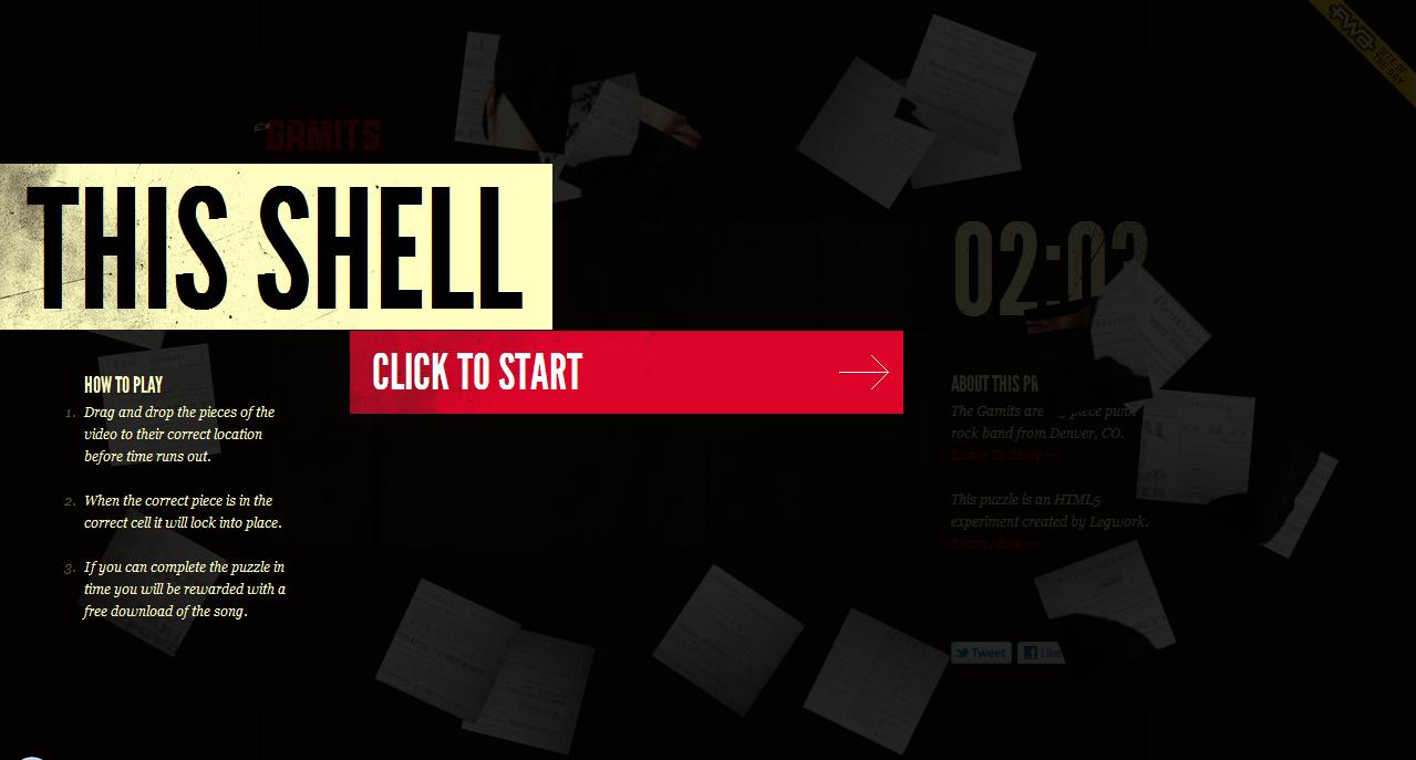
http://thisshell.com/
Design of website is pure and nice. Colours were also used very softly and eurhythmically.

http://catrabbit.com.au/
There are not any unnecessary things at this website, it's plain and simple, but I like this side of it.

http://www.coullon.com/
Showing products with a model is nice at this webpage.

http://www.stellamccartney.com/en/index.html
I liked this site too much because of its cloud buttons such as work, about and contact. Its colours are nice too.

http://www.orangeyouglad.com/
I liked its design and especially using green header effectively :)

http://pcnw.org/
This site is very funny, colorful and childish, but it's very nice and loaded full of energy :) Its buttons (home,blog, shop etc.) are so compatible and interesting.

http://www.yipori.com/
I think this website has an interesting design. They used a book image to create design of website, I liked this idea :)

http://www.wingcheng.com/
Hiç yorum yok:
Yorum Gönder