
31 Mayıs 2011 Salı
I changed my header again :)
I tried to make my header more attractive, so I made bigger the header and changed one hat. I also changed the texture of some letters. Finally, I did this :)

24 Mayıs 2011 Salı
I changed the design of my website ;)
I changed the design of my website again :) Firstly, I played the background. I tried to remove the blog background and then, I maximized the background. Moreover, I also added some playful hats like a gadget to my website and I changed their texture and colour according to my website design. I added buttons instead of "older post, new post and home" choices.
Here are the some screenshot from my website, I hope you will like it ;)


Here are the some screenshot from my website, I hope you will like it ;)


28 Nisan 2011 Perşembe
Changing header and template...
I decided to change my header after the feedbacks. Firstly, I did my website like this:
However, the black part didn't look so good, then I changed the template of my website like this:

I also changed the colour of text, because at this time everything looks so pinky, but I think it became better now:

I will change the black transparent background and background of header too, but I think I will do it for next week :)
 |
However, the black part didn't look so good, then I changed the template of my website like this:

I also changed the colour of text, because at this time everything looks so pinky, but I think it became better now:

I will change the black transparent background and background of header too, but I think I will do it for next week :)
6 Nisan 2011 Çarşamba
Posts...
I posted lots of information and nice photos about hats to my other blog. These are some screenshots from it:


http://calinnaashatshop.blogspot.com/


http://calinnaashatshop.blogspot.com/
This is my header homework :)
I tried to do a header for my other blog website(calinnaa's hats shop). First, I played with opacity of my background. Then, I created this header ;)
22 Mart 2011 Salı
Inspiring Websites
Its design which includes lots of interesting objects are interesting and nice.

http://www.gardenerandmarks.com.au/
This also an interesting one, acting objects make it very funny :)

http://www.moodsofnorway.com/#/home
Including lots of photo can be a good idea like this site.

http://www.demodern.de/
The designer used a colorful background image which makes it energetic, and he/she also used a big white area effectively.

http://www.springstudios.com/
This is also another funny website. It seems like there is no strict order, everything is more independent.

http://www.ipolecat.com/#xlwn286
I liked its colour :)

http://www.rgacom.com.br/
I think, simple black drawings like hand-drawings are looking very good... I liked them.

http://www.legworkstudio.com/
The effects of site after starting are very dynamic and entertaining.

http://thisshell.com/
Design of website is pure and nice. Colours were also used very softly and eurhythmically.

http://catrabbit.com.au/
There are not any unnecessary things at this website, it's plain and simple, but I like this side of it.

http://www.coullon.com/
Showing products with a model is nice at this webpage.

http://www.stellamccartney.com/en/index.html
I liked this site too much because of its cloud buttons such as work, about and contact. Its colours are nice too.

http://www.orangeyouglad.com/
I liked its design and especially using green header effectively :)

http://pcnw.org/
This site is very funny, colorful and childish, but it's very nice and loaded full of energy :) Its buttons (home,blog, shop etc.) are so compatible and interesting.


http://www.gardenerandmarks.com.au/
This also an interesting one, acting objects make it very funny :)

http://www.moodsofnorway.com/#/home
Including lots of photo can be a good idea like this site.

http://www.demodern.de/
The designer used a colorful background image which makes it energetic, and he/she also used a big white area effectively.

http://www.springstudios.com/
This is also another funny website. It seems like there is no strict order, everything is more independent.

http://www.ipolecat.com/#xlwn286
I liked its colour :)

http://www.rgacom.com.br/
I think, simple black drawings like hand-drawings are looking very good... I liked them.

http://www.legworkstudio.com/
The effects of site after starting are very dynamic and entertaining.
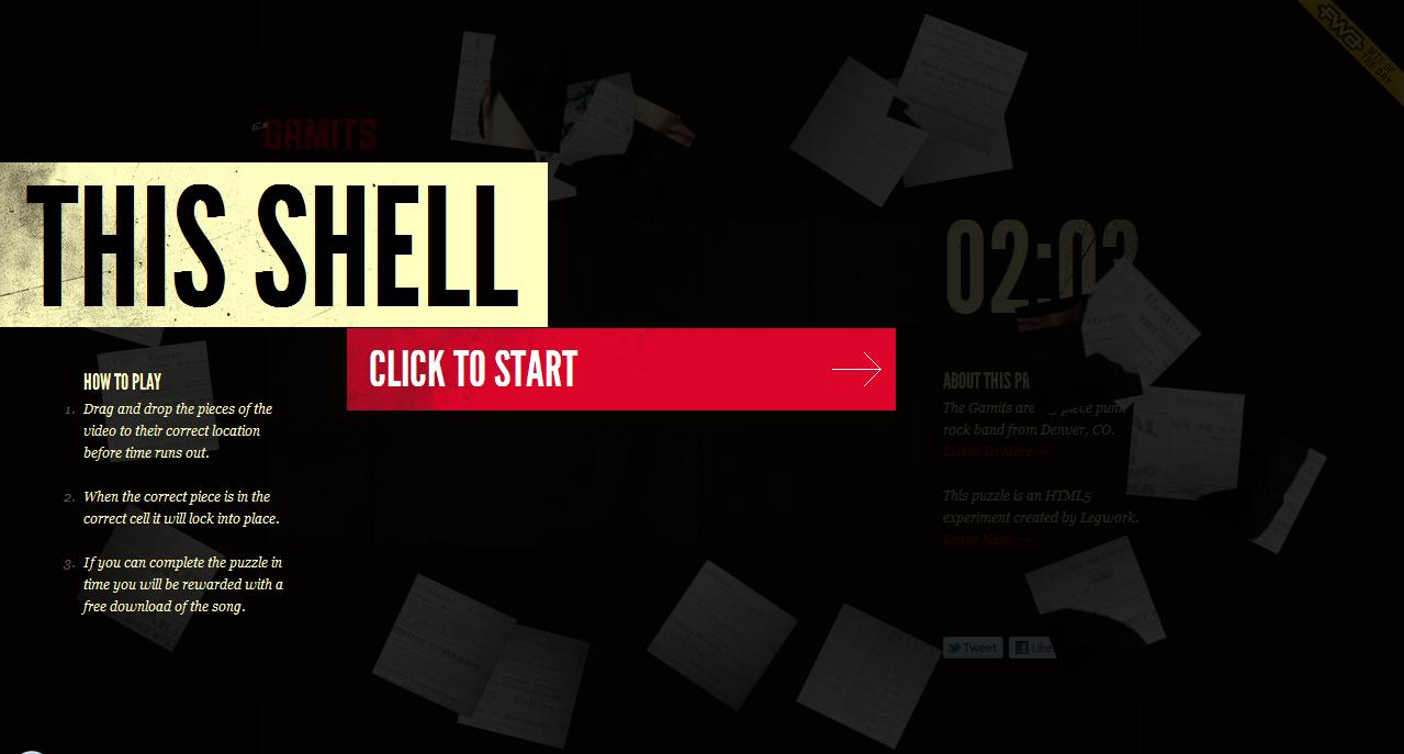
http://thisshell.com/
Design of website is pure and nice. Colours were also used very softly and eurhythmically.

http://catrabbit.com.au/
There are not any unnecessary things at this website, it's plain and simple, but I like this side of it.

http://www.coullon.com/
Showing products with a model is nice at this webpage.

http://www.stellamccartney.com/en/index.html
I liked this site too much because of its cloud buttons such as work, about and contact. Its colours are nice too.

http://www.orangeyouglad.com/
I liked its design and especially using green header effectively :)

http://pcnw.org/
This site is very funny, colorful and childish, but it's very nice and loaded full of energy :) Its buttons (home,blog, shop etc.) are so compatible and interesting.

http://www.yipori.com/
I think this website has an interesting design. They used a book image to create design of website, I liked this idea :)

http://www.wingcheng.com/
17 Mart 2011 Perşembe
Kaydol:
Kayıtlar (Atom)